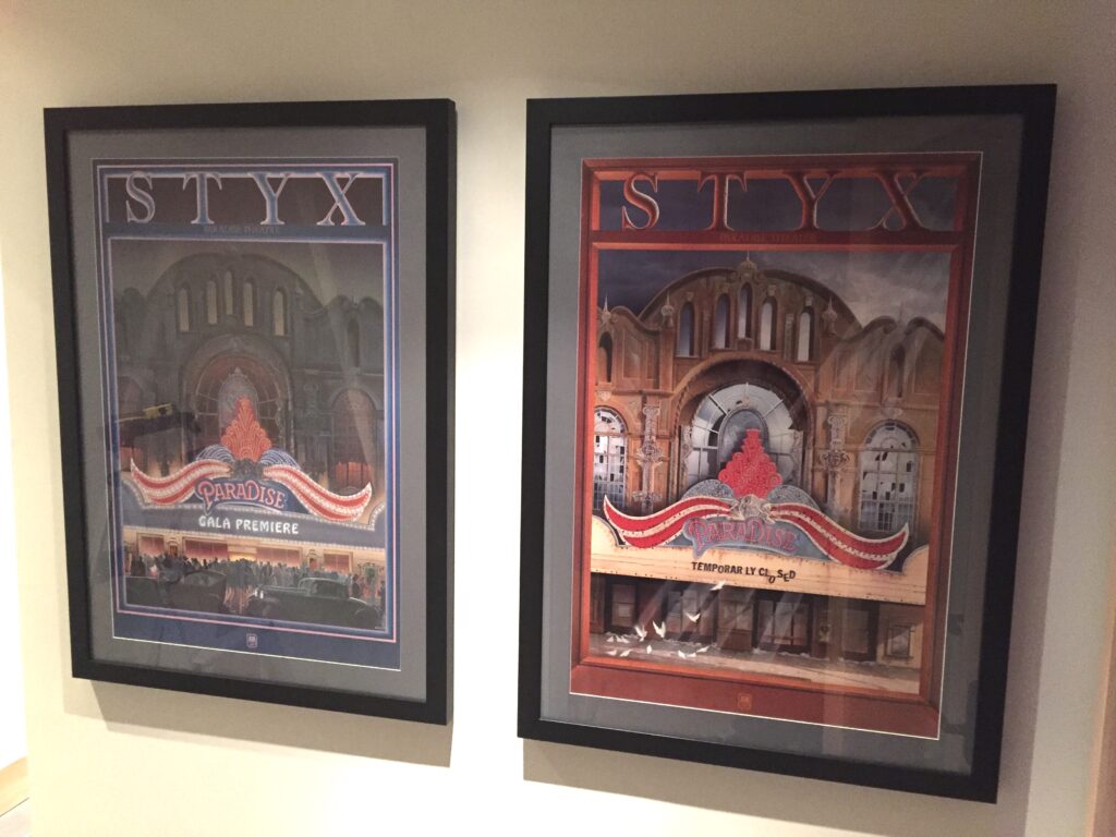
As a kid growing up in Chicago in the 70s and 80s, I was a huge fan of that “local Chicago band that made it big,” Styx. We’ve just picked up some new wall art from the band’s only number 1 album, 1981’s Paradise Theatre.
Founded as “Tradewinds” by Dennis DeYoung and fraternal twin brothers John and Chuck Panozzo in the early 60s, Styx found superstardom in the mid-70s with a string of hits including “Lady,” “Come Sail Away,” “Fooling Yourself (The Angry Young Man),” “Renegade,” “Blue Collar Man (Long Nights),” and “Babe.” Their albums The Grand Illusion (1977), Pieces of Eight (1978), Cornerstone (1979), and Paradise Theater (1981) all went triple-platinum.Of those four, Paradise Theater was the band’s most successful album, reaching number 1 in the USA in 1981. It is also one of my favorite Styx albums. A “concept album,” the record tells the fictionalized story of the Paradise Theater, a real-life movie theater on Chicago’s West Side, and features the hits “Too Much Time On My Hands,” “The Best of Times,” “Rockin’ The Paradise,” “Nothing Ever Goes As Planned,” and “Snowblind.”

In 1980, while looking for ideas for Styx’s next album, Styx lead singer Dennis DeYoung came across Robert Addison’s Paradise Theater serigraph in an art gallery. The image supposedly depicts Chicago’s Paradise Theater shortly after it closed in 1956 (it was completely demolished by 1958).
DeYoung saw the theater’s sad tale — an opulent showpiece that failed to anticipate and adapt to the changes that overtook the film industry with the coming of sound, and later, the popularity of television — as an allegory for the changes that were overtaking America as the country moved through the 1970s into the 1980s.
Styx’s Dennis DeYoung saw the sad tale of the real-life
Paradise Theater as an allegory for the changes that were
overtaking America as the country moved through the 1970s into the 1980s.
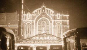
Interestingly, Addison’s serigraph drew inspiration not from the real-life Paradise Theater’s architecture and marquee, but from that of the then-still-standing Granada Theater in Chicago’s Rogers Park neighborhood. Ironically, the similarly opulent Granada met a similar fate to the Paradise in 1990, when, after having not been regularly used as a movie theater since 1973, it was torn down and replaced with a senior living center.
Built during the silent movie era, at its opening in 1928, the Paradise Theater was promoted as the world’s most beautiful theater. Outside the real-life movie house, the marquee featured ten different colors of twinkling light bulbs.

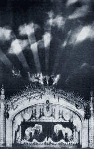
Inside, patrons marveled at the breathtaking domed ceiling over the 3,600 seat auditorium. Before the start of each movie, the mural of the Greek god Helios, the god of light, would be “set in motion” with a projected light show. I can only imagine how cool this early example of “lighting automation” must have been. If you’ve visited our studio and experienced all the different ways we try to bring the theatrical aspects of lighting into our recording spaces, you can understand how these details would really resonate with someone like me.
[blockquote blockquote_style=”boxed” align=”none” text_align=”justify”]
Elements of the light show at the Paradise Theater changed depending on the time of day —
an early example of “lighting automation.”
[/blockquote]
Unfortunately, the theater’s design (particularly the domed ceiling) caused huge problems when “talkies” took over the motion picture industry. What looked beautiful didn’t sound beautiful — domed ceilings tend to reflect sound in odd ways that can interfere with the listener’s ability to clearly understand spoken dialogue. When the movies were silent, and only accompanied by the theater’s Wurlitzer organ, these acoustic defects didn’t really matter that much. Once the actors on screen began to talk, though, the characteristics of the theater’s architecture made for an uncomfortable listening experience. The theater began losing patrons to a nearby competitor, the Marbro Theater, which offered much better acoustics and was better suited to the era of the “Talkie.” The owners of the Paradise closed the building only three years after its opening, in 1931, hoping to “wait out” the Great Depression that was then underway. The theater reopened in 1934 with an improved sound system. Still, the theater never became particularly profitable, and with the arrival of television in the early 1950s, the writing was on the wall for many of these massive movie houses. Ultimately, the theater that was built to stand forever only lasted 28 years before it was closed for good in 1956. By 1958, the theater was demolished, and the site sold to a supermarket chain.
[blockquote blockquote_style=”boxed” align=”none” text_align=”justify”]
In 1980, with Styx recording their 10th studio album,
they needed a cover.
[/blockquote]
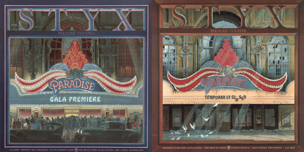
So in 1980, when Styx began work on their 10th studio album, they needed a cover. Working with their label at the time, A&M Records, the band hired artist Chris Hopkins to design a “then and now” set of images (the technical term is a diptych) showing, first, a fictionalized version of the Paradise Theater at its opening in 1928, and then, another depiction shortly before its demolition began in 1956. Like Addison’s serigraphs, Hopkins’ artwork similarly draws inspiration from the Granada Theater rather than the actual Paradise Theater.
Hopkins’ two images of the fictionalized movie house, each fitting a square aspect ratio, graced the gatefolded front and back covers of the Paradise Theater LP. I would argue that the primary album artwork, the “before” image of the theater’s 1928 grand opening, is Styx’s most famous piece of cover art.
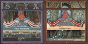
I also had a cassette copy of this album, and I remember noticing that the cover artwork, which showed the two images side by side, was shaped more like a pair of posters rather than the square-shaped versions on the record sleeve. It being the pre-Internet and pre-Photoshop era, I really had no idea how they’d somehow, seemingly, created two different versions of the same artwork, with one version showing more of the theater and sky above the marquee than the square version.

Chris Hopkins was nominated for a Grammy for his work on Paradise Theater. He finds it “funny and disturbing” that this is likely his most famous work, because he was 26 when he painted the images, and believes his skills improved considerably since then.
[blockquote blockquote_style=”elegant” align=”left” text_align=”center” cite=”- Chris Hopkins”]
“Lovers of old theaters and Styx fans really aren’t interested in anything else that I’ve painted.”
[/blockquote]
As for me, though, I’ve always loved these images. The “before” image shows the theater at the absolute height of its splendor. It’s the kind of image that makes you want to grab a magnifying glass just to appreciate the artist’s creativity in his depiction of the fine details in the architecture, marquee, and sculptures. Even the lighting — the flawless patterns in the marquee, the spotlights shining up at the glowing night sky — conveys the drama and magic of Opening Night at “the world’s most beautiful theater.”
The “after” image, in the stark light of day, turns everything on its head. Here, the viewer gets to appreciate the artist’s creativity in depicting the theater’s decay. Bulbs are missing on the rusted, bent marquee; the statues are missing hands and whole limbs; the box office’s “Coming Attractions” poster box shows an ad for “Sparky the Flying Dog,” the kind of pathetic act typical of a venue that’s circling the drain towards closure. And rather than spotlights shining up at the sky, beams of sunlight shine down on the sidewalk, where the massive Opening Night crowd of dignitaries and celebrities has been replaced by a few birds pecking at the sidewalk on a drab Tuesday afternoon.
Now, to be fair, the birds and sunbeams (along with the substitution of the real-life Granada Theater’s profile for that of the Paradise) are taken pretty directly from Robert Addison’s serigraph, so Addison deserves the credit for those ideas. I’ve never heard whether A&M Records went through any sort of negotiation with Robert Addison before deciding to hire someone else to make an image that heavily borrowed from his earlier work.
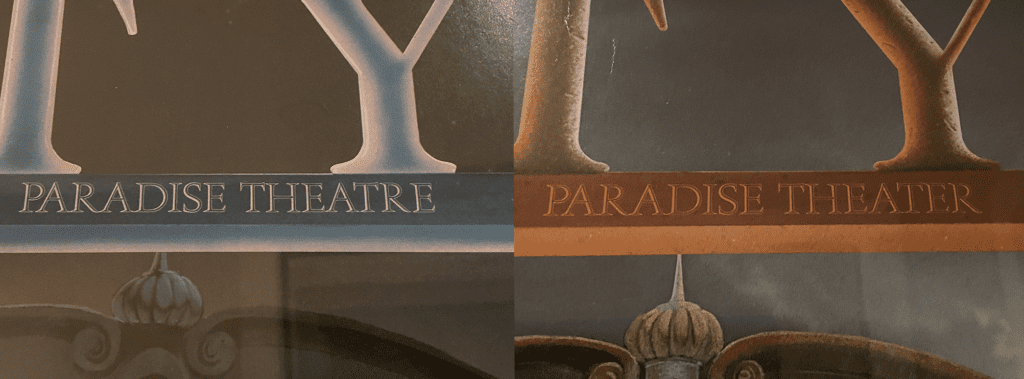
I think the other reason these images hit home with me is because I’ve always had a bit of a fascination with “failed public attractions,” such as dead shopping malls, decrepit amusement parks, and abandoned sports stadiums. Recent American history is replete with stories like the real-life portion of the Paradise Theater story: buildings and venues that begin with heady plans, massive investment, great fanfare, and huge crowds, only to later sit empty, sometimes for many years, awaiting a “new idea” when the original idea isn’t profitable. Sometimes these stories feature a succession of owners, each of whom saw promise in the failed project, only to later watch their own investment go down the drain. More often than not, it seems, the story ends with a date with the wrecking ball.
Doing even a small amount of research for this blog post, I have been struck by how many incredible, ornate theaters were built in my hometown in the first half of the 1900s, only to be torn down in the latter half of the century. Even the Marbro Theater, the Paradise Theater’s 4,100-seat local competitor, which started drawing away audiences once “Talkies” arrived, only lasted 8 years longer than the Paradise before it was demolished in 1964. “Talkies” may have spared the Marbro, but television certainly didn’t. In that regard, if the real-life Paradise Theater is a cautionary tale about huge dreams failing to anticipate changes in the future, it is not a particularly unique one.
[blockquote blockquote_style=”boxed” align=”none” text_align=”justify”]
If the real-life Paradise Theater is a cautionary tale about huge dreams failing to anticipate changes in the future,
it is not a particularly unique one.
[/blockquote]
There is a recent movement in photographic circles known as “ruin photography” or even, heh, “ruin porn.” The criticism of this style of photography is that it is exploitative of the people who often still live in and around the environments being photographed. Entire residential sections of Detroit, for example, are fascinating to such photographers, who, the criticism goes, trot into town, expensive cameras in hand, while ignoring the fact that their “ruined landscapes” are still inhabited by real people.
That’s certainly a fair criticism.
But personally, I think my interest is more in the study of seemingly good ideas after they’ve gone bad, or exciting places that time has passed by — the days, months and years after the curtain came down for the last time, after the home team lost its last game and moved to greener pastures, or after the amusement park’s owners could no longer afford to keep the twinkling lights on. All of these venues are left waiting for a crowd they will never see again.
Near where I grew up in the western suburbs of Chicago, there was a combination mall and indoor amusement park known as Old Chicago.
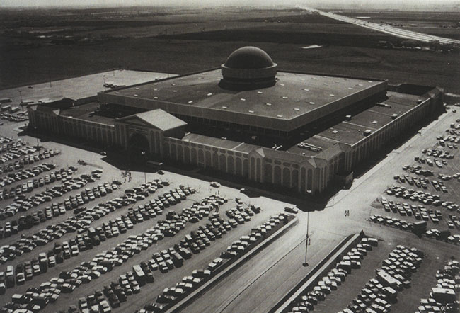
The venue opened to great fanfare in 1975, only to go into a downward spiral a year later when the lack of “anchor stores” at the mall led to a drop in attendance, which in turn caused more stores to close, and so on. Later development projects that combined shopping malls and amusement parks, such as Minneapolis’ Mall of America, corrected this oversight.
Old Chicago finally shut down in 1980, with the owners entertaining any number of ideas about how the building might be salvaged — as a baseball stadium for the White Sox, as an international trade pavilion for China, a movie soundstage, even as a possible venue for the cancelled 1992 World’s Fair. I can vividly remember driving past the massive building, the facade over the boarded up entrance still bearing the words “OLD CHICAGO” in turn-of-the-century style writing, surrounded by a huge, eroding sea of parking lot asphalt. But none of the ideas for how to reuse the building ever came to fruition, and it was finally torn down in 1986.
In any case, whether or not structures like Old Chicago or the real-life Paradise Theater ultimately survive, the “echoes” of these buildings’ former uses fascinate me. It’s probably for that reason that I enjoy Chris Hopkins’ diptych of the Paradise Theater so much: you see the theater both in all its unspoiled glory, and as a sad shell of its former self after its dreams fell back to earth.
[blockquote blockquote_style=”boxed” align=”none” text_align=”justify”]
Whether or not these structures ultimately survive,
the “echoes” of their former uses fascinate me.
[/blockquote]
Earlier this year, I was poking around eBay and happened across a listing for a poster sized version of the “before” image of the Paradise. I had never seen this artwork rendered in a poster sized image before (although I would assume Hopkins’ original paintings must be at least this size, if not significantly larger). I was intrigued. I thought it’d be really cool to have both images in the set, but at the same time I resigned myself to the likely reality that I probably wouldn’t be able to find an “after” poster. I don’t imagine they were only printed in matched sets, first of all. Second, the image of the Paradise on its opening night, I figured, is the “standard” image for the album. If you only had room for one poster in your record store window, that would likely be the one you’d use. And while the “after” image is very cool in its own right, and in some ways more compelling than the “before” picture in its details, I don’t think it works as well on its own. It’s the contrast between opening night and the wear-and-tear that fell upon the theater that’s most interesting. As a standalone image, the “after” picture just feels like…well, to use the criticism leveled against the photographers traipsing through the urban decay of cities like Detroit…ruin porn.
[blockquote blockquote_style=”boxed” align=”none” text_align=”justify”]
By itself, the “after” image of the Paradise Theater just feels like…
well, ruin porn.
[/blockquote]
And then, about a month ago, another listing popped up on eBay — only this time, someone was selling BOTH posters as a set. They weren’t described as being in perfect condition, but nevertheless, I was willing to take a chance and see what they looked like. I snapped them up right away.
When they arrived and I took them to the art store to be dry mounted and framed, I had my doubts about how well they’d turn out.
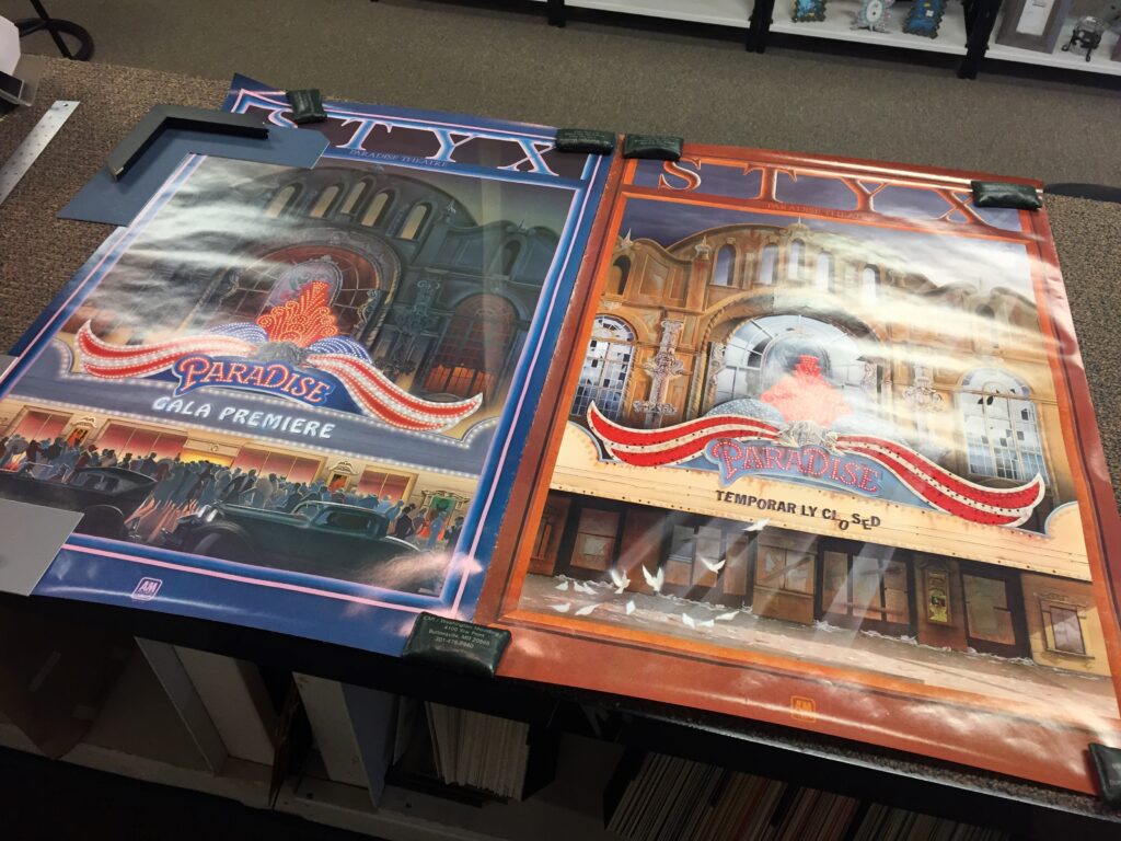
The colors of both posters were very vivid and look great for 35 years old, but the paper is a little rough, particularly around the edges of each image. I wasn’t sure how well they’d take to being dry mounted — whether the wrinkles would come out or just get worse.
Well, the finished, framed posters arrived back at the studio yesterday.
They look amazing. I hung the finished posters up on the wall today, just outside the main door to the studio. There, I will see them every day, as I walk in and out of the studio…a favorite pair of images from a favorite album.
Share this:
- Click to email a link to a friend (Opens in new window) Email
- Click to share on X (Opens in new window) X
- Click to share on Facebook (Opens in new window) Facebook
- Click to share on LinkedIn (Opens in new window) LinkedIn
- Click to share on Pinterest (Opens in new window) Pinterest
- Click to print (Opens in new window) Print

